MARRIOTT.COM
BOOKING FLOW REDESIGN
A redesign of booking flow for Marriott.com.

Client: Marriott
Industry: Hospitality
Year: 2022-2023
Challenge:
Outdated booking design on Marriott.com called for an update with a new design system. Ongoing user testing revealed key areas for streamlining to enhance the overall user experience.
Objective:
With 20% of bookings on Marriott.com completed via guest checkout compared to just 2% on the mobile app, our goal was to leverage this redesign to convert guests into members on web experience.

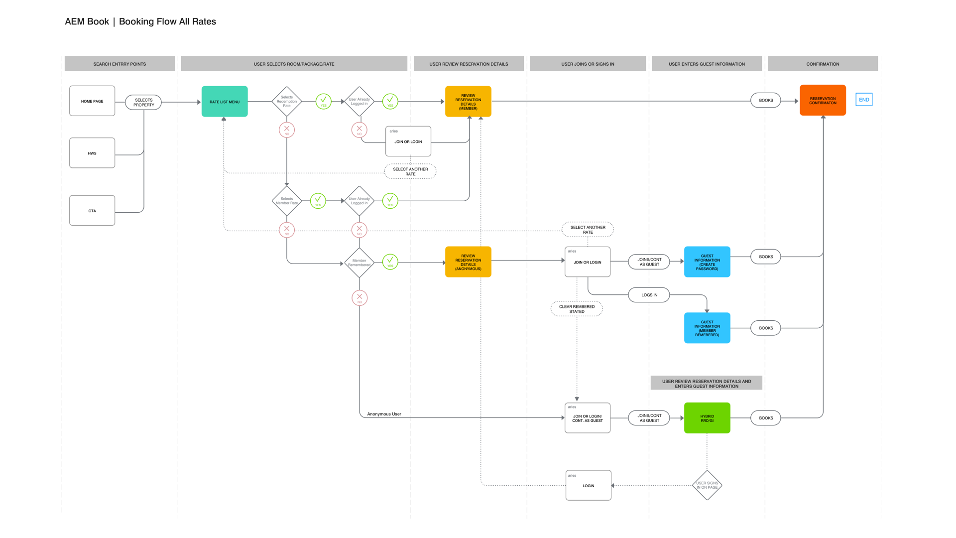
BOOKING FLOW
Booking a room with Marriott isn't just a transaction—it's a journey divided into four key stages. I contributed to the design of three of those four stages.
Stage One: The Search
It all begins with entering your destination. This is your canvas, your starting point. The search results populate and you have a world of hotels at your fingertips. Here, you choose the perfect place that will be your home away from home.
Stage Two: The Rate List Menu (RLM)
After selecting your hotel, you're guided to the Rate List Menu. Think of it as the hotel's menu of offerings. Different room options, varied rates—it’s all laid out for you. What's fascinating is how the rates adapt based on your Marriott Bonvoy membership status, available packages, and any points or rewards you've accumulated. It's personalized, tailored to make the most of your loyalty.
Stage Three: The Checkout Process
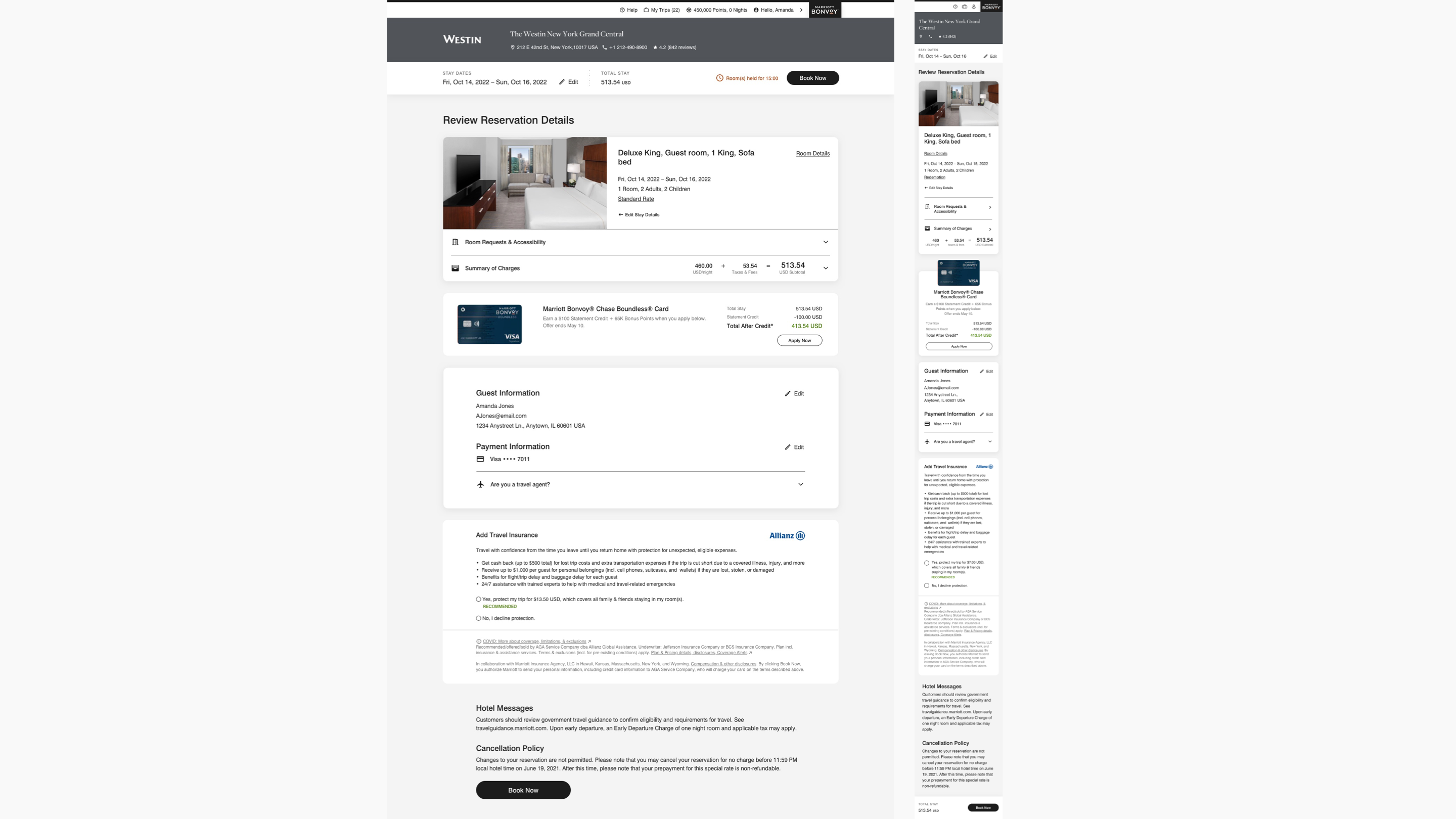
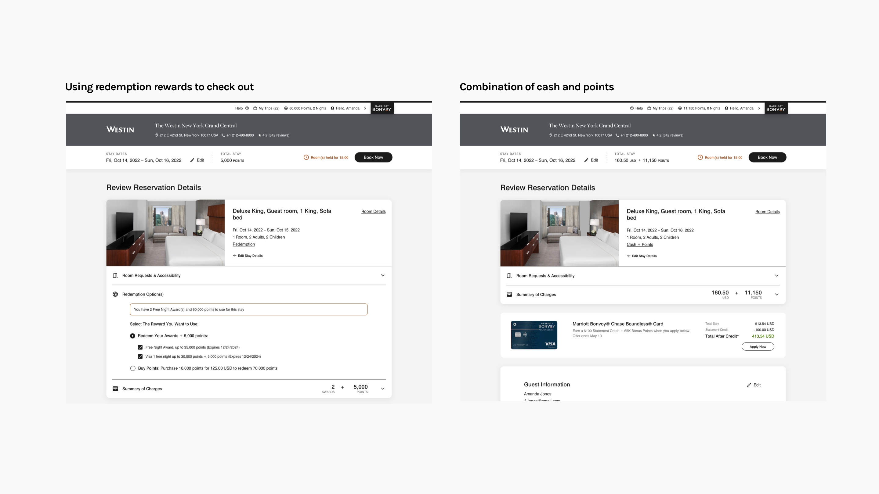
Once you've picked the ideal room on the RLM, the path splits slightly. If you're a guest without a membership, you're taken to the Guest Information page. Members, on the other hand, proceed to the Review Reservation Details page. This is the final stretch—the checkout. It's where you double-check everything, ensuring all details align with your expectations before confirming the booking.
Stage Four: Reservation Confirmation
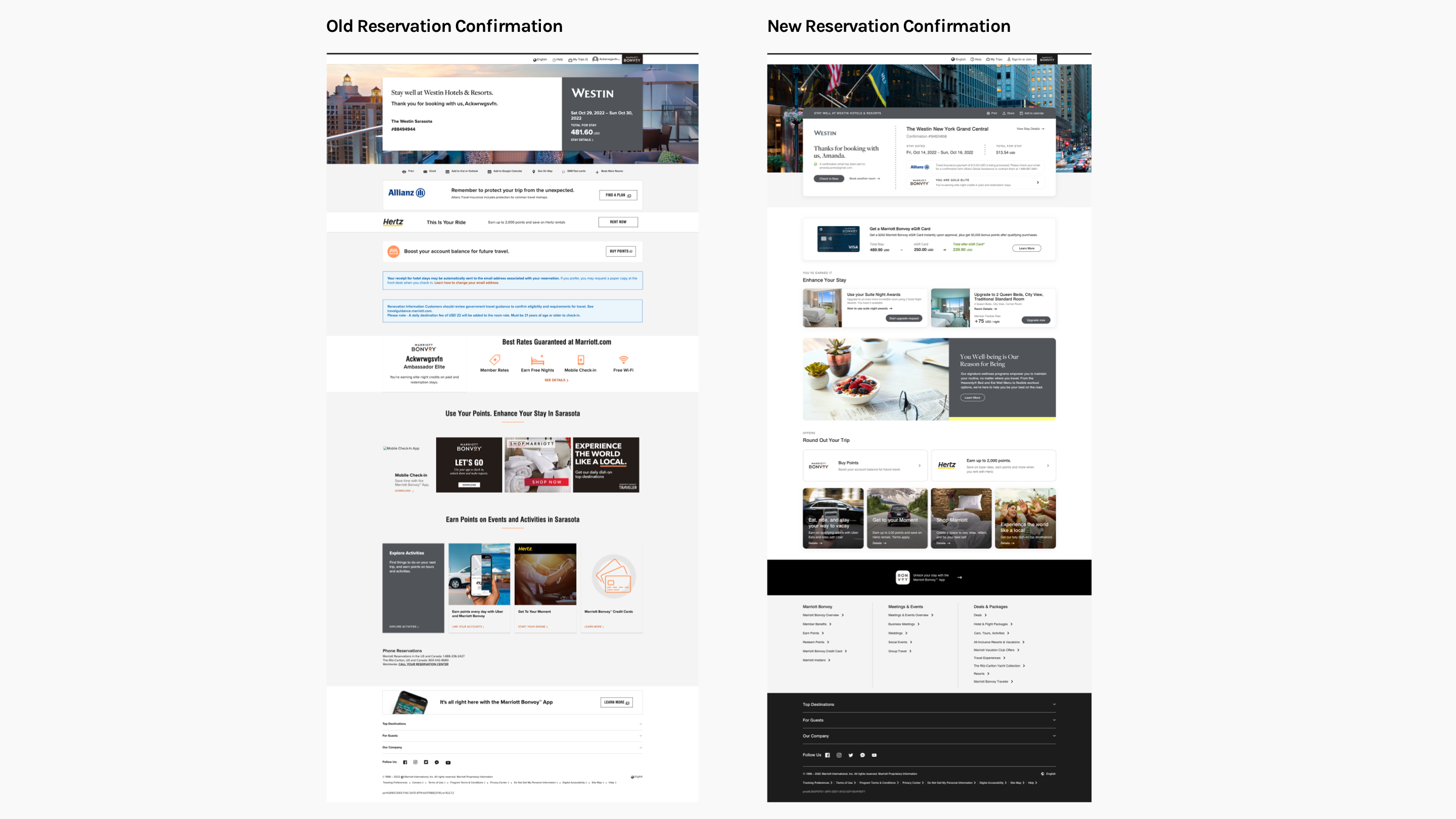
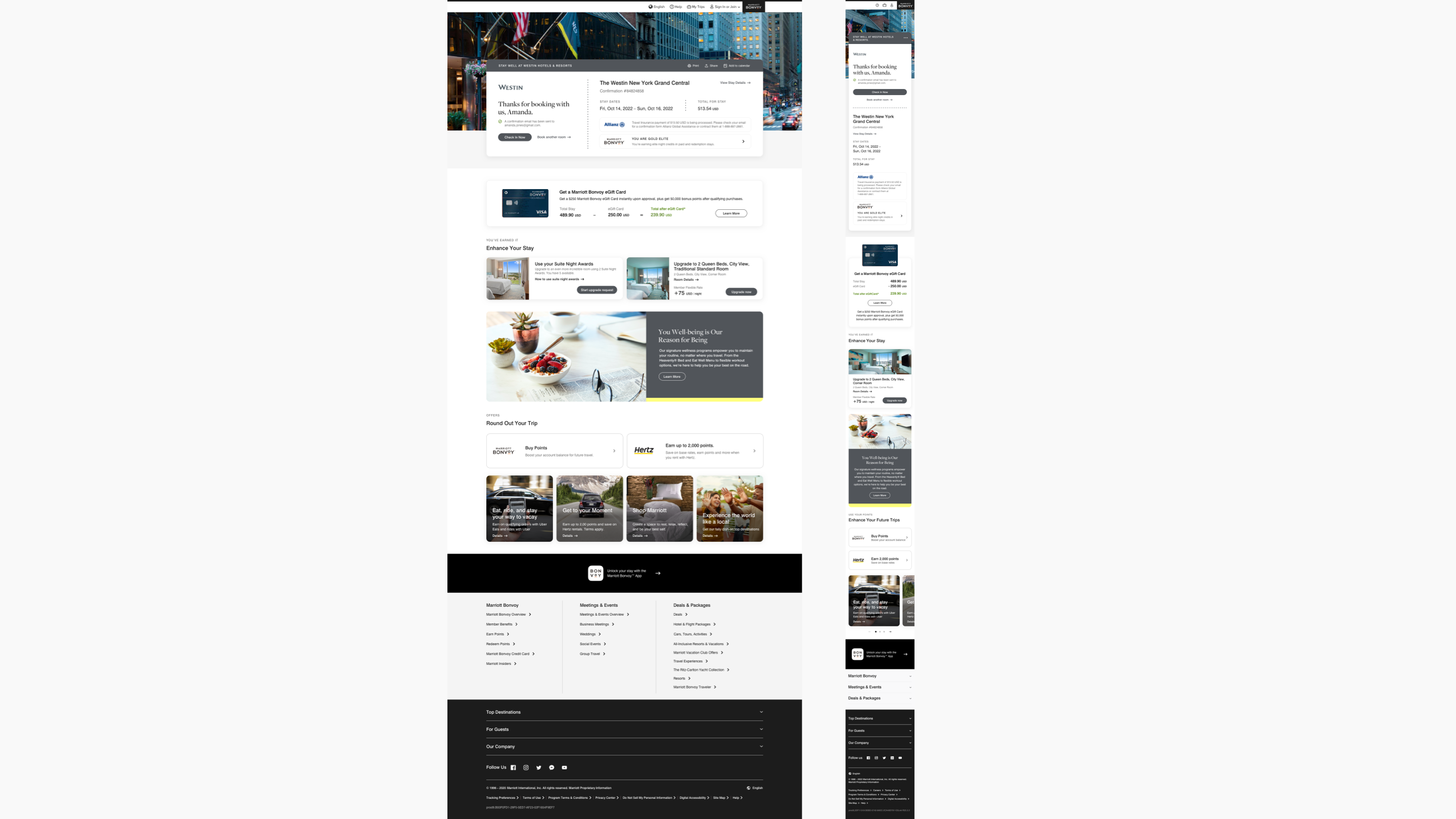
Booking complete, you arrive at the Reservation Confirmation page. But it's more than just a receipt. This page provides a comprehensive overview of your reservation and unveils additional information about the property to enhance your upcoming stay. It's the bridge between the planning and the experience, setting the stage for what's to come.
In essence, Marriott's booking flow is designed to be intuitive and rewarding, especially when you leverage the benefits of membership. Each stage is crafted to enhance your journey, from the moment you search for a hotel to the instant you receive your confirmation.
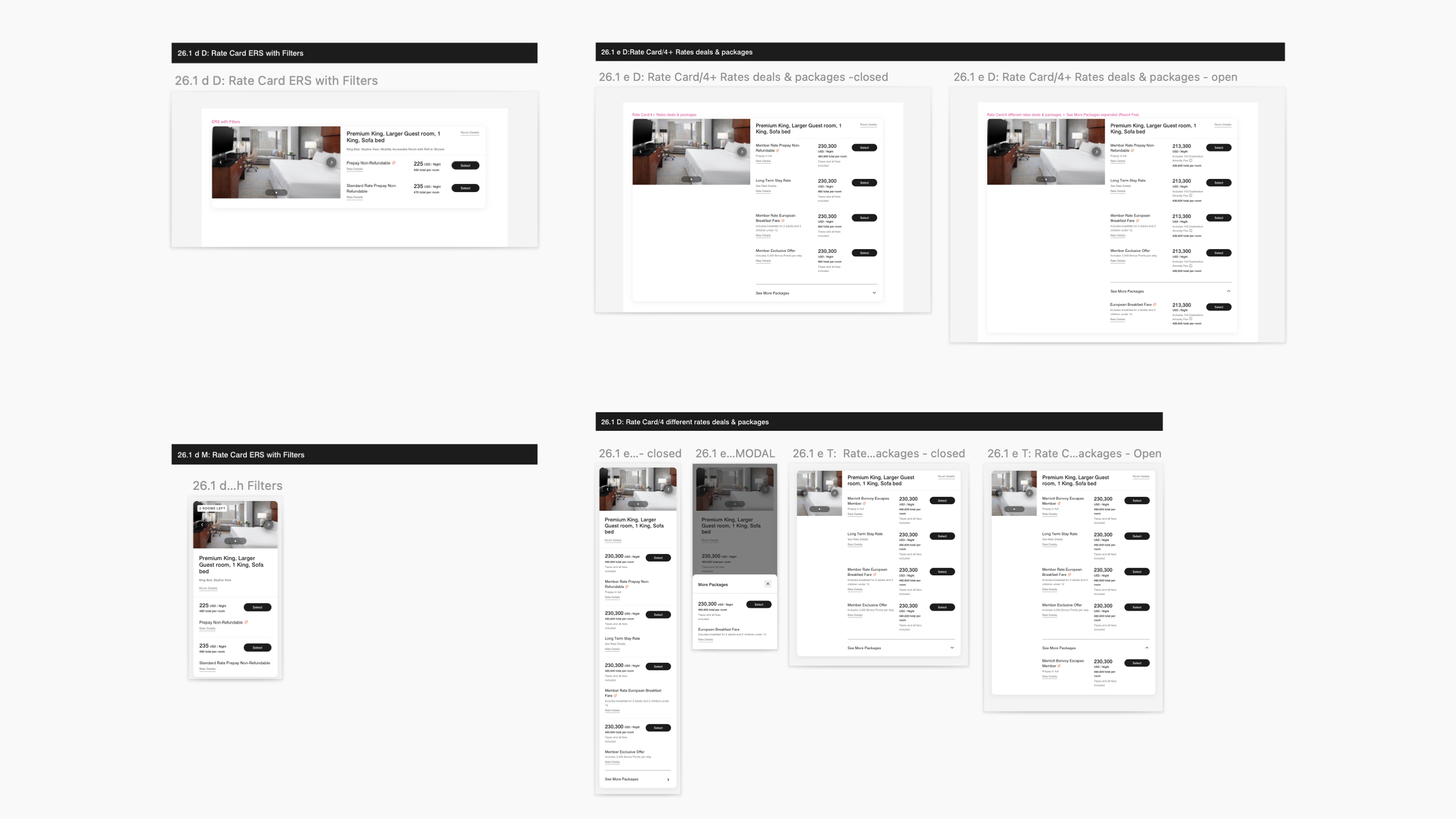
RATE LIST MENU
The Rate List Menu (RLM) serves as a search results page displaying available hotel rooms. Within the RLM, users can browse various rate options—such as Prepay & Save, Deals & Packages, and Points—to accommodate different preferences. Members who have enough points for a free stay can access the Points section to customize their booking using their rewards. To enhance usability, we introduced a mini slideshow to the room thumbnails and conducted several A/B tests to clearly differentiate between member and guest rates.


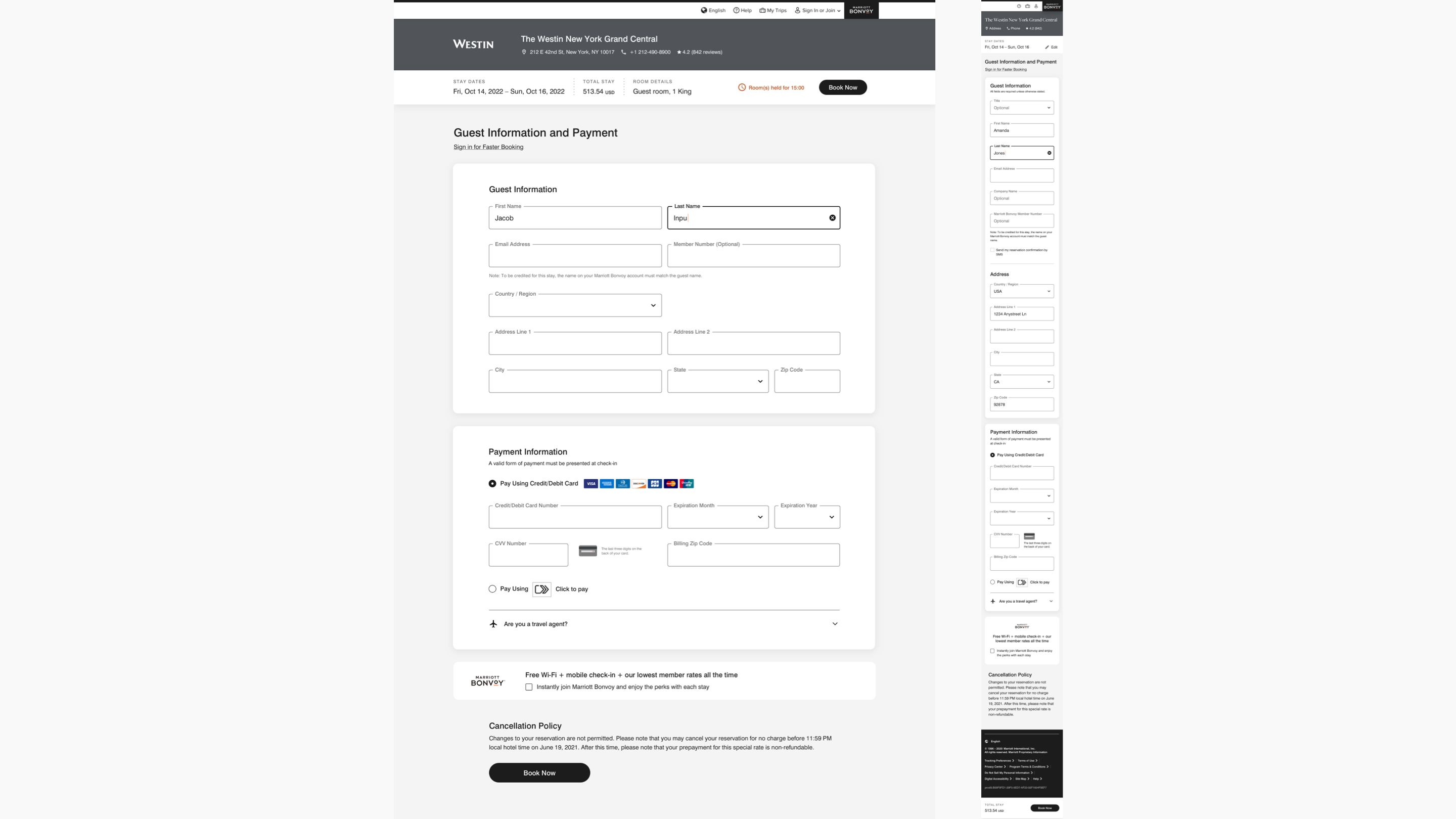
REVIEW RESERVATION DETAILS
The Review Reservation Details page on Marriott.com functions as a checkout page where bookings are finalized. The experience is divided into guest checkout and member checkout. For guest checkout, the focus was on encouraging guests to join the Bonvoy program. Meanwhile, for member checkout, the emphasis was on streamlining the process to provide an intuitive experience while maintaining consistency for users across various redemption options.

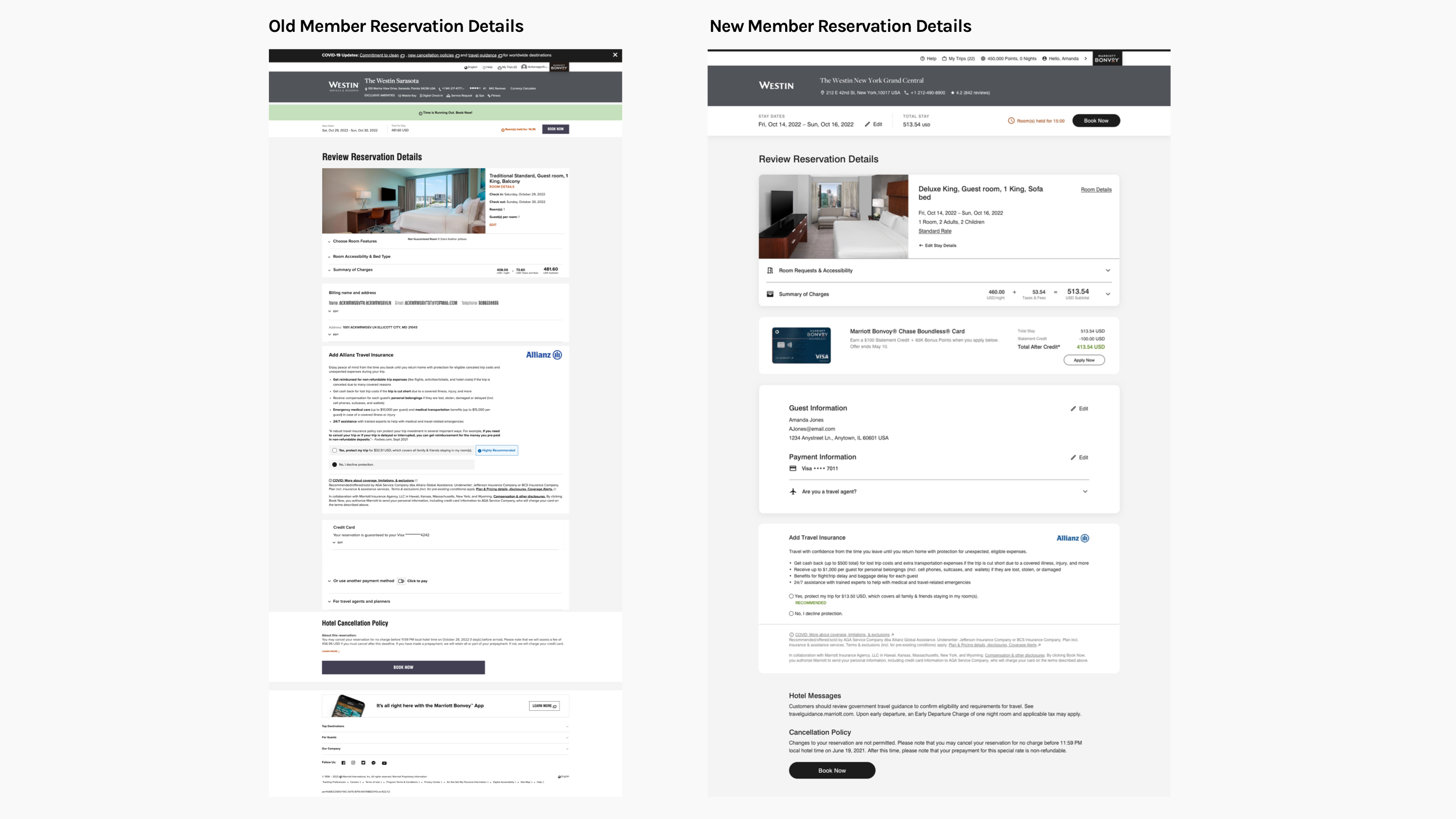

RESERVATION CONFIRMATION
In the new design, the reservation confirmation module integrates add-ons such as insurance to provide a more complete and premium looking receipt compared to previous design. This final page offers an opportunity to upsell upgrades and promote the Marriott Bonvoy credit card, utilizing standardized promotional modules for future scalability.
Solution:
Collaborating closely with various stakeholders, we redesigned the booking flow to enhance aesthetics, usability, and accessibility for users with disabilities. The entire process took just over a year, involving constant iterations before its market deployment.
Impact:
The redesign significantly enhanced the user experience, resulting in a more than 25% increase in converting guests to members on the web compared to the previous design.
ROLE: DESIGN LEAD, UX, UI
© 2020 | All rights reserved by Wonjun Song